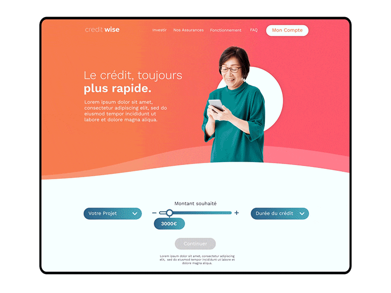
In Autumn of 2020 I set about designing the homepage for an online credit company working in France. I used gradients, rounded shapes, client photography, simple icons, and interactive tools to create a clear, simple user interface.

Rounded shapes are ideal for separating out the content, while gradients bring a modern, techy look and feel. Drop-down menus are easy to navigate, and a slider helps the user choose the amount of credit needed. The UI is there to make the user experience as streamlined as enjoyable as possible.